New interface

  • 11 January 2021
  • 2 replies
  • 603 views

Userlevel 5


Hi,


I would like to share my impressions about the new interface here
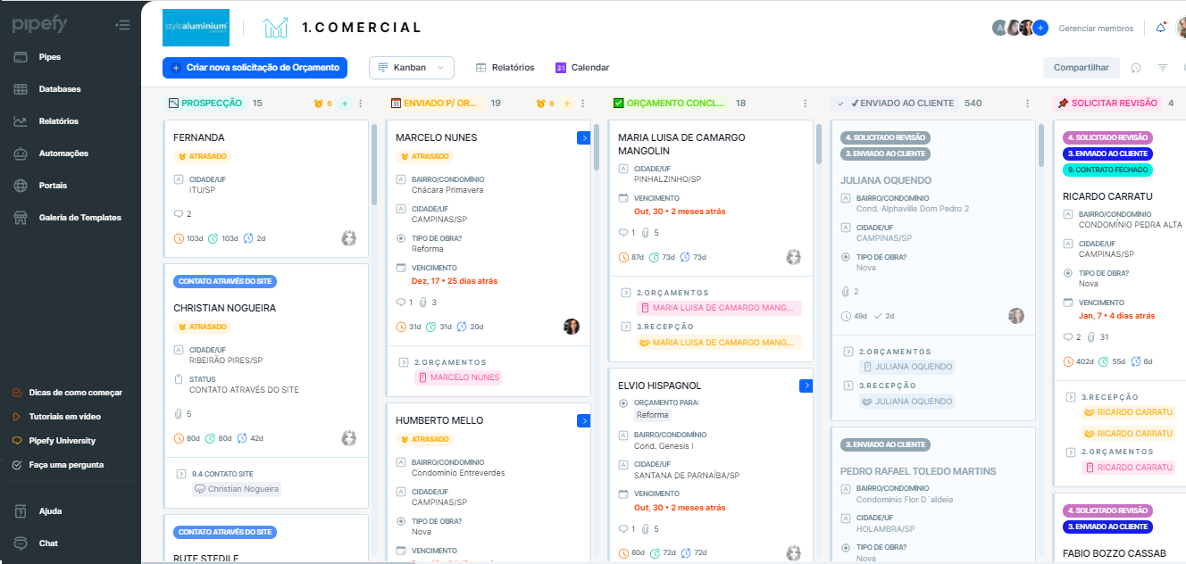


What bothers me most is the clarity of the due date:
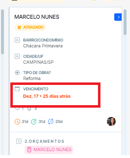


Because it is not so clear and diffuse with the other information on the card…


Another thing that bothers me, is the title of the apparent field on the closed card, just the answer (as it always has been) is enough:
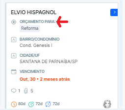


This makes the card size very extensive


A good thing are the labels:
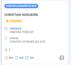


At most I really liked the updates and the open card interface, what I still didn't like is the look of the closed card.


2 replies

Userlevel 3

Hey @amanda_malaquias 

My name is Maurivan Luiz and I am the Principal Designer responsible for leading Pipefy Design team in the design of this new interface, nice to e-meet you.
 

First of all I would like to thank you for your feedback here in the Pipefy Community. We are working closely with our consumers and feedbacks like this are important for us to evolve our product.
 

We are in Beta version and we have identified some colors and borders that will work better the contrast until the official launch of the platform. We are doing our best to improve, and consequently we will work on the duedate field on the closed card as well.
 

Glad you liked this feature of the labels, it allows our costumers to have more visibility about your process.
 

Would you be willing to talk to our UX Research team to better understand some points and perceptions you had when using this new interface for the first time?
 

If so, I can connect you directly with our UX Research team for a quick chat.
 

And whenever you have feedback you can send it to us. It is a pleasure for us to have the opportunity to improve our product by listening to consumers voice.

Userlevel 5

Hi, @maurivan 

Thanks for the answer.


Yes! I would like to speak with the team, whatever I can contribute I will be available.


Reply