Hello Community!
We're thrilled to kick off this week with some exciting updates that are sure to elevate your experience within our community. Without further ado, let's dive into the details!
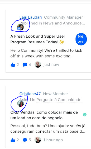
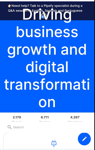
💎Fresh Look for the Main Page: Get ready to be greeted by a sleek and revamped main page! We've worked hard to enhance the user interface, making it more intuitive. Navigate effortlessly as you explore the wealth of resources our community has to offer. As I'm sure you've noticed!
⭐Super User Program Relaunch: Great news for our Superusers - the Super User Program is back in action starting today! We've revamped the program to offer even more benefits. Here's a glimpse of what's new:
-
New Points Table: Earn points for your contributions and unlock exciting rewards. The more you engage, the more you earn!
-
Trade Points for Experiences: In addition to prizes, Superusers can now trade their earned points for exclusive experiences with our team. Get ready for one-of-a-kind interactions and insights!
-
Exclusive Materials: Gain access to exclusive materials, ensuring you stay at the forefront of industry trends and community updates.
-
Courses/Certifications: Enhance your skills with specialized courses and certifications that will be made available exclusively to Superusers.
-
Face-to-Face Events: Super Users will also have exclusive access to face-to-face events, providing a unique opportunity for in-person networking, learning, and collaboration.
-
Apply to Star in Online Events: Showcase your expertise by applying to be a featured speaker or contributor in our online events.
👉🏼More Updates Coming: This is just the beginning! Stay tuned throughout the week as we unveil additional updates, features, and opportunities within our Community. We're committed to making your experience here exceptional.
We can't wait to hear your thoughts on the new look and the Super User Program enhancements. Your feedback is invaluable in shaping the future of our Community.😃


