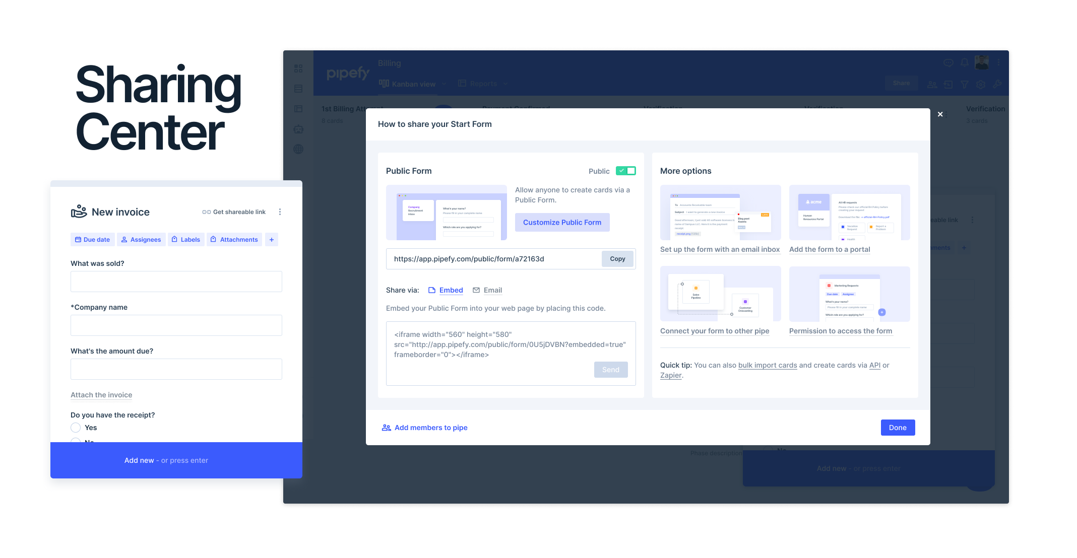
Very good! @Felipe Scholz! I loved the new improvement especially the option of embedding it on web pages!
This is a great way to bring together multiple features. All these features were pre-existing but are now organized together correct? Also kudos for updating the relevant help documents in conjunction with the launch of this feature
Only small feedback is the button is a different in format than all the others. Maybe share, members, settings, and tools should be under a pancake menu or similar? Overall the Pipefy nav is just getting a bit uncoordinated with 6 different areas: 1) a left nav bar for pipes, databases, reports, etc.. 2) top right buttons for notifications and profile menu, 3) 5 function icons under than + share button, 4) 2 drop down nav links at the top, 5) a new button at the bottom right, 6) and 3 more link icons at the bottom left…
@savicbo We're expecting to release big improvements in our main UX/UI in the next 2 quarters. In this transition period, it will look a little bit disorganized, but it will be a temporary issue. Improvements under construction. =D
Thanks kindly for the info, always fun to get a cameo from the founder
Glad to hear even more great things are on the way - we look forward to a sneak peak!