

Hi,
I would like to share my impressions about the new interface here
What bothers me most is the clarity of the due date:
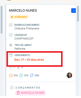
Because it is not so clear and diffuse with the other information on the card…
Another thing that bothers me, is the title of the apparent field on the closed card, just the answer (as it always has been) is enough:
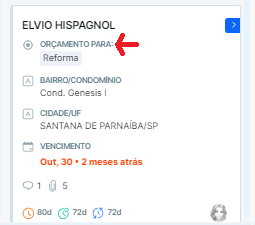
This makes the card size very extensive
A good thing are the labels:
At most I really liked the updates and the open card interface, what I still didn't like is the look of the closed card.